i like it, looks clean, prefer other tho, still nice tho(god am not a fussy man!)


You are using an out of date browser. It may not display this or other websites correctly.
You should upgrade or use an alternative browser.
You should upgrade or use an alternative browser.
dont like it
- Thread starter dave
- Start date
Currently reading:
dont like it
Thats a terrible reason... the current logo uses white text?!?dave said:i no like this

the new banner needs to be white back ground, it stands out more and cheaper to make, wont see white words on it
Hold up. let me have a go with that. I think it might look a but cluttered though.Stuart DemonD said:I am not sure of it either - and then I read Rob's post - I like the idea of the 4 blue boxes :chin:
current one looks like shrinked old one? 
agree :yeahthat:
hmm i havent seen it change once at all , so its all a bit confusing apart from the one above shrinking
hmm i havent seen it change once at all , so its all a bit confusing apart from the one above shrinking
ahhh... your cache hasn't updated. Hold down ctrl and press refresh.
hmm done now lol
looks good but prefer the old one
you were saying u dont want a coloured back ground cus of printing it? well why not make it a transparents background on the pic so u print it out easily
J
lollooks good but prefer the old one
you were saying u dont want a coloured back ground cus of printing it? well why not make it a transparents background on the pic so u print it out easily
J
OP
OP
well der. your banner is not whiteben said:Thats a terrible reason... the current logo uses white text?!?
you can see gazs banner for miles away, because its white clean and clear
Gaz's banner would have cost the same in any of the base colours. It's just vinyl on a coloured base
Ignore the colour matching in the background (quick knock up) - but here's the two with a full bar and a small bar.


Personally I prefer the first one...
Personally I prefer the first one...
how about tryign to split the bars into 4? and put the 2 of the letters into one box or summin like thatben said:Ignore the colour matching in the background (quick knock up) - but here's the two with a full bar and a small bar.
OP
OP
that one
but would prefer more boxes 1 for each letter
Gazs banner was free, how much was yours? double with a :nerner:
but would prefer more boxes 1 for each letter
Gazs banner was free, how much was yours? double
with a :nerner:- Joined
- Sep 20, 2004
- Messages
- 9,999
- Points
- 1,291
what about having the word "forum" in the old Fiat font?
See my previous question re: What font is it?serin said:what about having the word "forum" in the old Fiat font?
EDIT: Looks like it's Arial.
Blame Sammi, I didn't know we were having a digital printing donedave said:that one
Gazs banner was free, how much was yours? double
i think a strong font looks better..?
- Joined
- Sep 20, 2004
- Messages
- 9,999
- Points
- 1,291
ben said:
i think a strong font looks better..?
Noo, not like that, also that fonts nothing like it
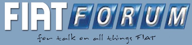
i mean have the wor "forum" like the old Fiat badge :- /F/O/R/U/M/
each letter in seperate boxes :idea: :chin:
OP
OP
like this?serin said:Noo, not like that, also that fonts nothing like it
i mean have the wor "forum" like the old Fiat badge :- /F/O/R/U/M/
each letter in seperate boxes :idea: :chin:

:devil:
- Joined
- Sep 20, 2004
- Messages
- 9,999
- Points
- 1,291
i quite like serin's version.
personally, i think the blue block thing should be narrower... it always catches the corner of my eye and is annoying.
or at least it should be the same single blue colour as the top band which holds the 'forum' 'guides' etc. links
personally, i think the blue block thing should be narrower... it always catches the corner of my eye and is annoying.
or at least it should be the same single blue colour as the top band which holds the 'forum' 'guides' etc. links