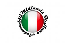

After a debate that seems to have gone on as long as Midlands Italia has been in existence (ooh: all of fourteen months...!), we finally have a logo design that:
I also think we should get this made up as an internal window sticker, too -- as well as on paper, as above... -- although I know this won't be cheap: so aim just to go for an internal version, to begin with. :chin:
Thanks to everyone who helped come up with this -- especially chips1 and Zeewulf. :worship:

The poll is self-explanatory (and private -- so no-one can see who voted for what...); and will close in a couple of weeks -- so that we can actually get around to producing these in time for the summer FF meets (e.g. Stanford Hall -- as I think Brooklands may be too close...).")
- I like (which is very important, me being boss an' all...);
- I think looks very professional (and, therefore, hope that others will, too...); :slayer:
- fulfils the design brief -- which is simply (as recently thought up by design guru FullMetalPanda...) to fill the vacant slot left by tax discs no longer being necessary, from October 2014.
I also think we should get this made up as an internal window sticker, too -- as well as on paper, as above... -- although I know this won't be cheap: so aim just to go for an internal version, to begin with. :chin:
Thanks to everyone who helped come up with this -- especially chips1 and Zeewulf. :worship:
The poll is self-explanatory (and private -- so no-one can see who voted for what...); and will close in a couple of weeks -- so that we can actually get around to producing these in time for the summer FF meets (e.g. Stanford Hall -- as I think Brooklands may be too close...).
Last edited: