Put me down for one.


You are using an out of date browser. It may not display this or other websites correctly.
You should upgrade or use an alternative browser.
You should upgrade or use an alternative browser.
Midlands Italia logo/sticker design: yay or nay...?
- Thread starter homeward
- Start date
Currently reading:
Midlands Italia logo/sticker design: yay or nay...?
Us hard to please. Looked good just needs a final touch up. Does anyone have an idea how much these would cost and how big they would be?
Just big enough to see but not so big that it blocks the view out the back window!!!
Just big enough to see but not so big that it blocks the view out the back window!!!
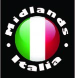
Design guru,me? You have met me right,not exactly a design guru I just have the occasional idea. I think the design is coming along nicely. A bold font that wraps around the sphere more and at each end having a full stop if that makes sense. Maybe also try it on a black background with white writing.

Does anyone have an idea how much these would cost and how big they would be?
Just big enough to see but not so big that it blocks the view out the back window!!!
When everyone can agree on the design, let me know sizes that would be required, as mentioned previously my father in law is a printer so I can ask him nicely for a good price, then we can compare elsewhere lol
I like the white on black.
Black on white for me
It's getting better for me I'ld say but still missing something and think its needs something car (or fiat) related on it like the out line of a fiat 500 or I don't know maybe a pair of pistons and con rods like a pirate flag  but whatever we choose I'ld go along with it as we need a signature sticker I much prefer the bolder writing as it's easier to read.
I also like the tax disc hold idea as I agree with Palio as I was going to keep mine on so how about making it a sticker that's tax disced size but the owner can then choose to either put it in the tax disc holder or peel the back off and stick it in the window
but whatever we choose I'ld go along with it as we need a signature sticker I much prefer the bolder writing as it's easier to read. I also like the tax disc hold idea as I agree with Palio as I was going to keep mine on so how about making it a sticker that's tax disced size but the owner can then choose to either put it in the tax disc holder or peel the back off and stick it in the window
Black on white for me
depends on the Car it's attached to ..
in my opinion CLEAR could be better than WHITE:idea:
Charlie
What if the flag was surrounded by the Fiat wreath
What if the flag was surrounded by the Fiat wreath
Showing your age..!!
I prefer the term "laurels"
good idea.. but is that YET ANOTHER colour /detail
That'll be meShowing your age..!!
No, they could be the same as the writinggood idea.. but is that YET ANOTHER colour /detail
depends on the Car it's attached to ..
in my opinion CLEAR could be better than WHITE:idea:
Charlie
I haven't yet asked for a blue version for my blue cars. It had crossed my mind a few times!! :devil:
Ok adding more things to the sticker if it is tax disc sized will then make the text smaller to read, it will be small enough I think without adding the Laurels.
depends on the Car it's attached to ..
in my opinion CLEAR could be better than WHITE:idea:
Charlie
Probable would, but depends on cost. If clear is way more expensive than white, white it is for me.
And I have a white car lol
I really like the redesign by chips especially the white on black. Only thing I might suggest is using all caps instead. As for any specific Fiat additions then I wouldn't want any. I obviously still own a Fiat but I like to think that the Midlands Italia group might also stretch to Alfas not just Fiat specific.
seicentoceeney
Member
I really like the redesign by chips especially the white on black. Only thing I might suggest is using all caps instead. As for any specific Fiat additions then I wouldn't want any. I obviously still own a Fiat but I like to think that the Midlands Italia group might also stretch to Alfas not just Fiat specific.
The stylised laurel wreath (which is what was mentioned) appeared in 1925 to reflect Fiat's success in the first competitive motor sport events. It could equally apply to Alfa's race success, Lancia's rallying, and Ferrari's F1 successes.
I doubt anyone would assume it was Fiat biased, but also don't think the badge needs cluttering up.
Anyway, the badge history was just me imparting a bit of useless information in case anyone's got bored of font sizes.....