
Not quite a camera question but i thought you lot would understand composition.
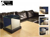
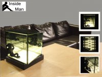
I'm re-doing some boards to show of a light i designed for uni but can't make my mind up on the how to lay them out. I need 2 A2 boards withminimal wording and they should be able to tell the 'whole story' of the product. I have attached some very rough (and badly photoshopped boards) to a, show the product to inspire and b, to show you were im at.
I had an idea of having a white faded brick background with the main image on the left, one off one on and 3 paint stripes of centre to the right at different lengths. To the right of those i thought about 3 boxes like:
1
2
3
either 2 with pics (1 and 3) and the other writing or the other way around.
Im thinking too much and my head hurts