New Mobile Site: Feedback Thread

Currently reading:
New Mobile Site: Feedback Thread

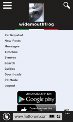
Something is acting a little strange. Tried again this morning and the top menu behaved itself, BUT I've scrolled down to the end of the thread & back up to find that the full expanded menu is on display. Just to be clear - the expanded menu doesn't look like it does when the page loads correctly and is then swiped from the left. The whole menu thing is spread out, menu icon at top left, search icon at top right and avatar in the middle. The background colours of the sidebar menu stretch to full width of screen. How do I capture screen on a Windows phone?
 
Last edited:
To answer my oWn question....on Windows 8.1 it's volume up & power buttons pressed at the same time.
Now, how do I attach an image in the mobile version? :)

Haven't done the attachments system yet :-(

I'm need to get hold of an 8.1 phone then to try that out. So it uses the default browser?
 
That would be cleaner, but would require jQuery. Trying to keep everything lightweight and non reliant on external libraries.

Unless you know another work around? I'm not the best at js :)

Heres a neat rendition in plain javascript https://github.com/jfriend00/docReady for that menu its probably sufficient to put the call just before the </body> tag though.
 
Heres a neat rendition in plain javascript https://github.com/jfriend00/docReady for that menu its probably sufficient to put the call just before the </body> tag though.
Well that's implemented, but doesn't seem to change anything.

I had the idea last night of setting the default visibility of the menu panel to hidden (then setting it to visible on window.onload) - but this would then mean users who had JS disabled would have no way to navigate anywhere.... :chin:
 
To answer my oWn question....on Windows 8.1 it's volume up & power buttons pressed at the same time.
Now, how do I attach an image in the mobile version? :)

You can now do attachments using "Go Advanced" :)
 

Attachments

  • 360504169_640.jpg
    360504169_640.jpg
    10.1 KB · Views: 141
Yay! It worked.

The more I use this mobile version the more I like it. Only tried it on the home WiFi so far though. Will give it a go on 3/4G later
 
Last edited:
Definitely a js issue, although strange as attachments need it to work too. Hmm..

Also see I need to hide the mobile app links on windows mobile too :)

Edit: Mobile app links now only show on relevant OS. Also changed the attachments inputs to 1 (as it auto uploads each time anyway, so you can never click the others)
 
Right then - I should have solved that issue with the menu bar showing up until the page fully loads.

It required a stylesheet update, so you'll need to do a "refresh" on a page to download the new version.

So if some people can test this - it should now just show the page as it's loading and not wait until full load to hide the sidebar (y)
 
Hi:) I'm very new on here but it is better now than a few days ago when I got the app:). I'm using an Acer e380 phone..
 
And Again Windows phones don't get a look in?
The only way i can successfully use this forum is on the desk top version where everything is the size of a micron.
All my mates use windows based phones, and the i phones popularity is diminishing because of cost and problems........and the lack of a usb socket for easy file transfer.
LUIGI

Hi Luigi,

I think you misunderstand mate - this is a mobile STYLE not an app - it should work perfectly on Windows Phone (one chap has been testing it for me :))

If you are still seeing the desktop site when you use your phone, simply go to http://m.fiatforum.com and it will force the mobile version.
 
Back
Top